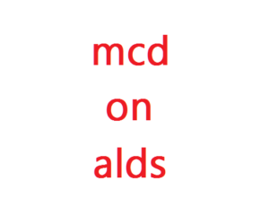
I saw a McDonald’s cup on the ground today (damn litterers 😒) and had to do a double-take because the new design uses an all-lowercase sans-serif font and breaks the name McDonald’s across three lines and looks an awful lot like it says “mcd on aids”. 🤦 Who thought of that? How did they miss it? Did they get fired? 🤔

Other people have noticed this epic-fail as well and now there are plenty of photos of it.
It’s even included in official marketing materials. 🤦
(I could have sworn it was all lowercase and no apostrophe. 🤔 Regardless, obviously what I thought I saw was memorable and that’s all that counts.)